In the interests of full disclosure, I should mention that the urgency that made this one actually happen was a requirement in a tender I was completing at the time. However, I do hope that it is a useful addition to my portfolio of support for clients, and intend, as I say, to continue to make them, as and when time and inspiration permit.
In the meantime, I thought that it would be helpful for me, and possibly of interest to some of my readers, to reflect on the process of making it, and the lessons learned.
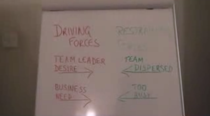
The first thing to say is that this is not my first attempt. Some time ago, I made one about Force Field Analysis. From that, I learned a few things.

- Whilst I like flip charts, they don't look very clear, let alone professional, on film, unless done more neatly that I generally have time to do...
- Stop-motion filming (the technique I used to make letters and words appear on the flip without seeing them being written up) is fun, but again, quite time-intensive.
- I can look and sound rather wooden on film, if I am not careful.
- Cutting between shots of my talking head and a visual aid needs to be done with care: sudden cuts are disorienting, and very short shots of visual aids are frustrating.
- Shirt colour matters: a pale shirt can look very washed out, and make me look more purple than I want to.
- The background matters: even a light switch can be a distraction!
The first take was not great. The good points were using a screen as a neutral background, and having my daughter behind the camera to zoom in and out a bit, providing some variety of shot.
However, there were several things I wanted to change. The main one was that I had my laptop on a low desk in front of me, and glanced down at it frequently. That was very disconcerting. Another was that I looked static and sounded wooden.
So we rigged up a step ladder to hold the laptop at head height, and I deliberately chose to deliver as I would to a group of people: actively scanning the room with my eyes, and using my voice and facial expressions very deliberately.
 Having filmed a take I was happier with, I then added in the visual aids. Some of these were deliberately the ones I use on the Workshop, so that people would remember them, strengthening the visual cues to help them retain the ideas.
However, on the workshop, I build up the Urgency and Important grid on a flipchart, and animate it by drawing on arrows etc. I decided to replace that by a Keynote version, as I thought it more likely to be clearer on video.
I was pleased with how that worked; and also pleased at the effect of re-visiting the same visual aid more than once, when relevant. I hope that gives the effect of attending a workshop - when one looks from the speaker to the screen and back again a few times during the discussion of a particular point.
 I was also careful to fade the visual aids in and out, to avoid abrupt transitions, and to make sure they were on screen for long enough, so that any text could be read, and images assimilated.
So overall I am more pleased with this attempt, but I think that there is still room for improvement:
- A few people have said they find my eyes scanning the room to be a distraction, so next time I will try to maintain the same level of animation, but looking straight to camera;
- Some of my examples ('most administration') are too generic: specific examples would be more helpful
- I will include a brief musical intro at the start and some more music at the finish.
However, I am particularly interested in feedback from others on this (and thanks to those who have already volunteered it). So if you have any views or ideas, do let me know.
For those interested in such things, the video was made using iMovie, and the visual aids using Keynote.

No comments:
Post a Comment